

How to level up your art direction
+ the psychology of pricing, and how to make money with your personal brand.
On social this week, Clayton reveals what yuppies do in NYC while Oren is procuring rare plants in LA. Perhaps, we’ve become stereotypes of ourselves?
But today, Clayton breaks down how to use art direction as a lever for growth, and Oren unpacks ideas about personal brand and social media as tools for creatives to drive revenue, with a quick note on the psychology and structure of proper pricing, and how to use it as a marketing tool.
P.S.
Oren is hosting a community call this Sunday, a live training on exercises for creative strategy on organic social media for brands, plus taking questions.

Let’s begin.
It’s time to level up your art direction
Most brand imagery looks the same right now. Rinse and repeat with the clean backgrounds, a centered product, and maybe a model standing there, looking off-camera.
And while it might feel safe, nobody remembers it.
But the brands and creators doing interesting visual work right now aren’t necessarily spending more money. They’re thinking differently about what a product photo or campaign can do.
So, let us explore some guiding principles we follow when creating content for a product campaign. The goal is to shift your brain from viewing art direction as an afterthought to a creative practice your prioritize.
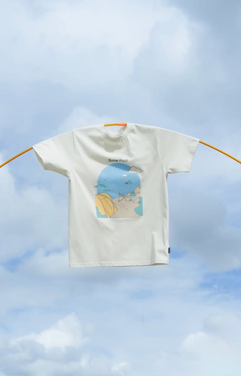
1. Tie it to movement
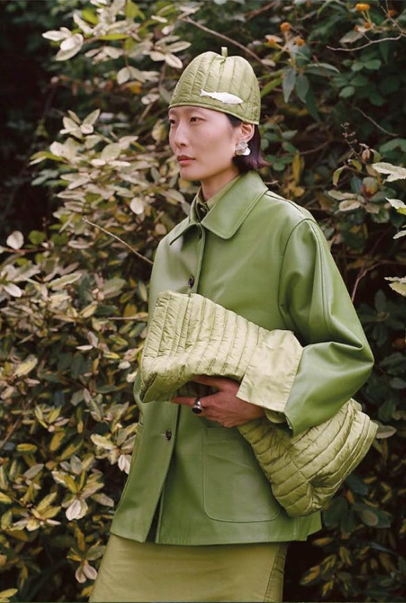
The easiest upgrade to any shoot is giving your subject something to do. A jacket looks fine on someone standing still. It looks alive on someone mid-stride, climbing over a fence, reaching for something on a shelf.
Movement creates context. It tells a story that the viewer fills in themselves, and it makes the product feel like it belongs in a life rather than a lookbook.
Static shots communicate “here is the product.” Movement communicates “here is what it feels like to wear it.”
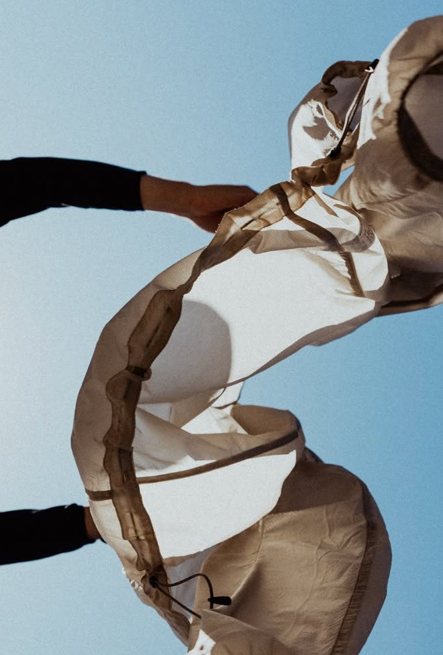
2. Create illusion with the product
Show people something they can’t see with their own eyes. A transparent jacket that reveals how lightweight its construction is. A cross-section that exposes the layering. An angle that makes familiar materials look alien.
This isn’t gimmick territory; it’s using visual language to communicate what a spec sheet can’t. When someone looks at your image and understands something about the product they wouldn’t have otherwise, you’ve done your job better than any caption could.
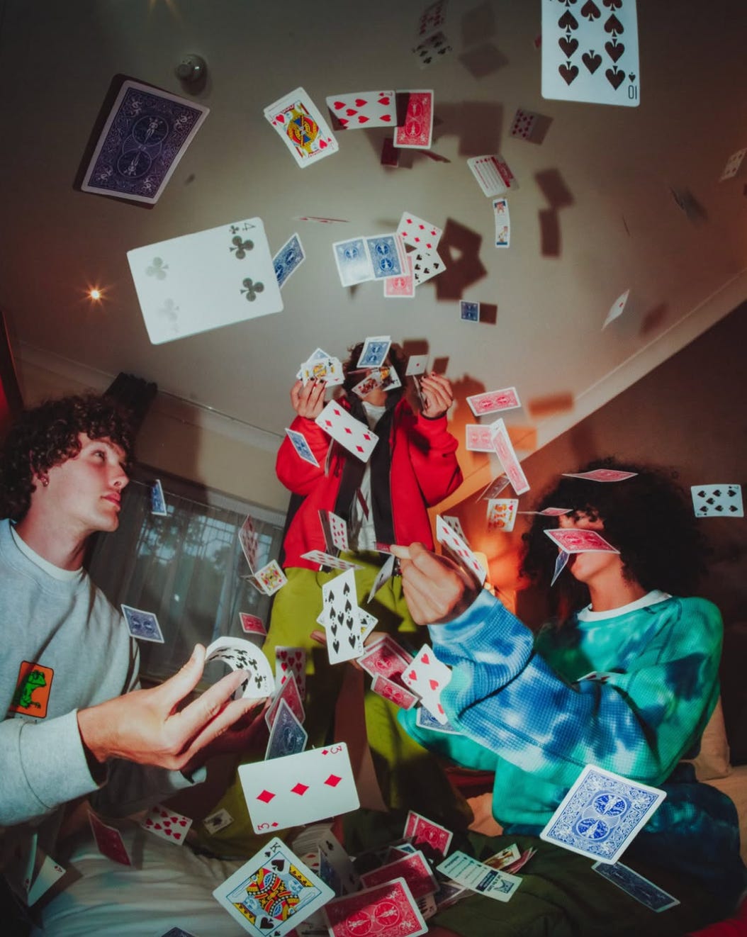
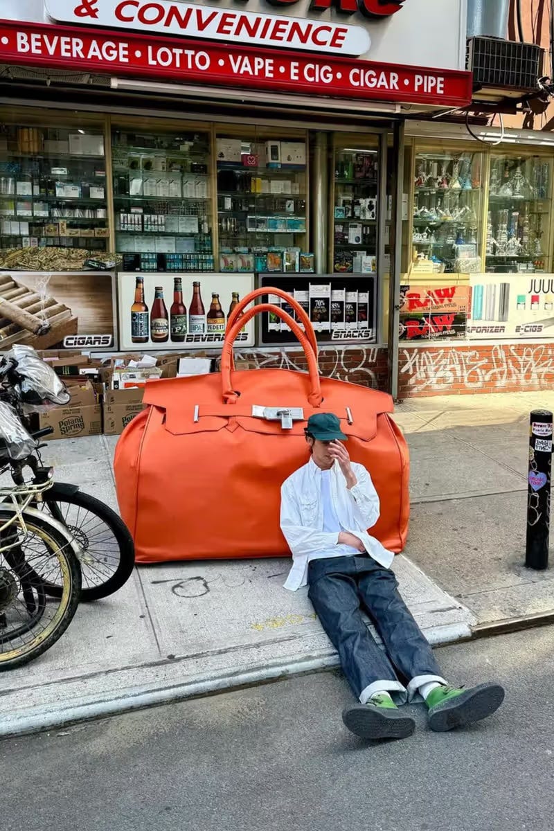
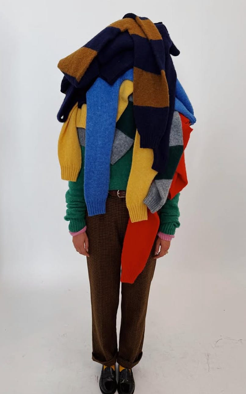
3. Turn the intensity dial up
Take one element and push it to an unreasonable degree. Supersize the product for a normal-sized person. Light it on fire. Freeze it in a block of ice. Drop it from a building.
The point isn’t shock value. It’s creating an image with enough visual tension that people have to stop and process what they’re looking at. In a feed where everything is polished and proportional, the disproportionate is a weapon.
You don’t need every shot to be dialed to ten, but having one or two that are gives you something people actually talk about.
4. Be weird on purpose
There’s a difference between “creative” and actually weird. Most brands aim for the first and land somewhere forgettable. The ones that commit to genuine strangeness, the kind that makes someone tilt their head or screenshot it to send to a friend, are the ones building real recognition.
This creates polarity, which is the point. Not everyone will love it. But the people who do will remember you, and that’s worth more than universal mild approval. Safe work doesn’t travel.
5. Own a backdrop
Pick a setting or visual motif and make it yours. Shoot everything in a garden. Only use industrial kitchens. Always include one piece of brutalist architecture. The specific choice matters less than the commitment to it.
Over time, that recurring element becomes a signature. People start associating the environment with your brand before they even clock the product. Format builds recognition, and recognition builds trust.
This is one of the lowest-effort, highest-impact moves in art direction, and almost nobody does it consistently.
6. Shoot it messy
The instinct is always to clean everything up. Straighten the collar, smooth the fabric, remove the wrinkle, fix the background. But intentional messiness communicates something that perfection can’t: realness, energy, a sense that the product exists in the world and not just in a studio.
Piled on top of each other. Crumpled on a chair. Half-unpacked from a bag. Worn in and slightly dusty. These images feel human, and human is what cuts through right now. The most memorable product imagery often looks like it wasn’t trying that hard, which, of course, is its own kind of art direction.
Next time you’re planning a shoot, look at the mood board and ask yourself: would I stop scrolling for this? Not ‘does it look good.’ Not ‘is it on brand.’
Would it actually make someone pause?
If the answer is “probably not,” you already know what to do. Throw something out and replace it with a decision that makes you a little uncomfortable. That discomfort is usually the thing the final image was missing.
How to make money with your personal brand
I’ve made a lot of tactical, information-based content about social media, but I'm constantly asked: how do you connect that to money? Notoriety in your career is gratifying…
But how do you use it to get work as a creative, execute brand deals, structure offers, and work for brands?
In this video, I talk about the updates to what is succeeding in content today on short-form networks, and how to think about leveraging that for revenue.
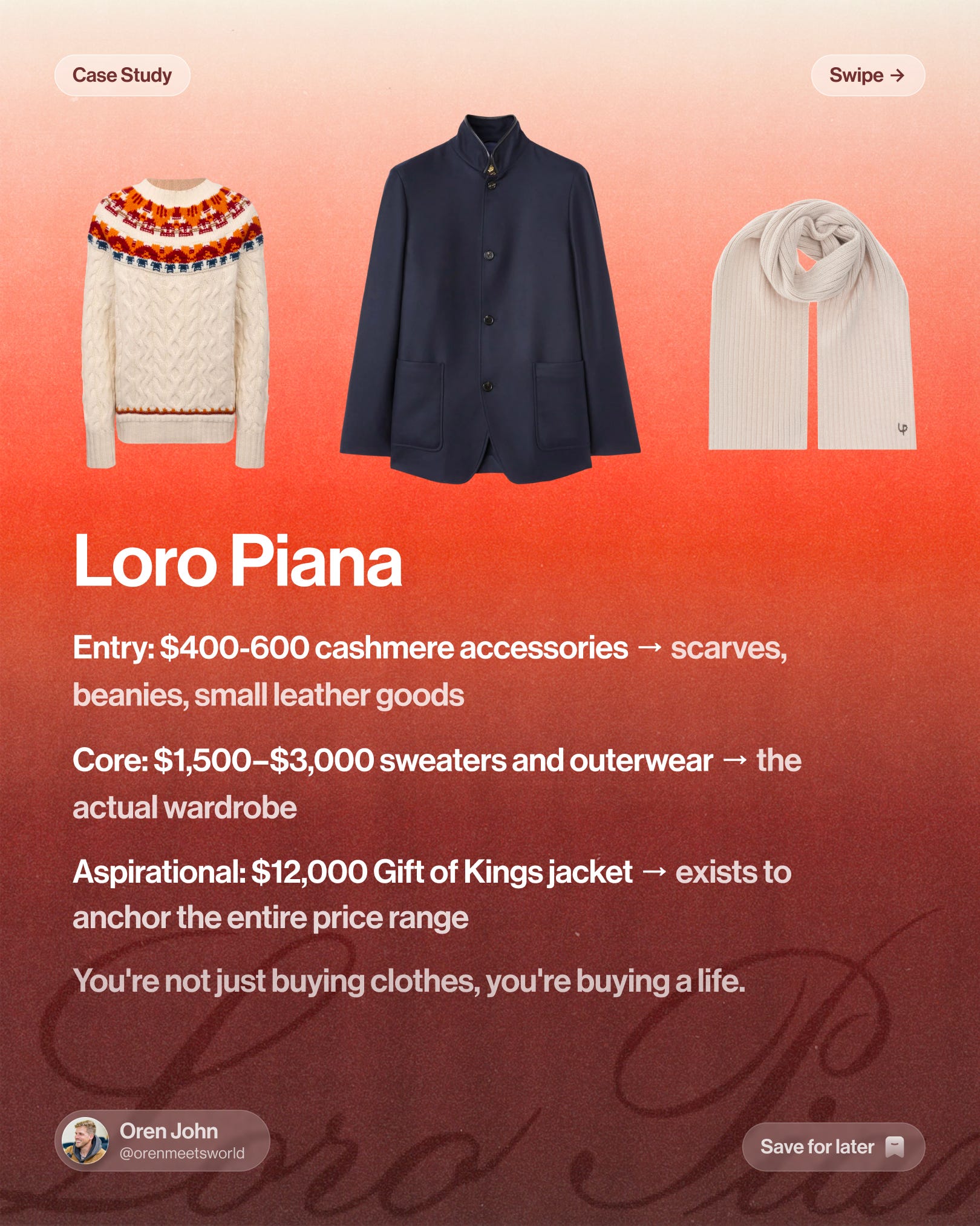
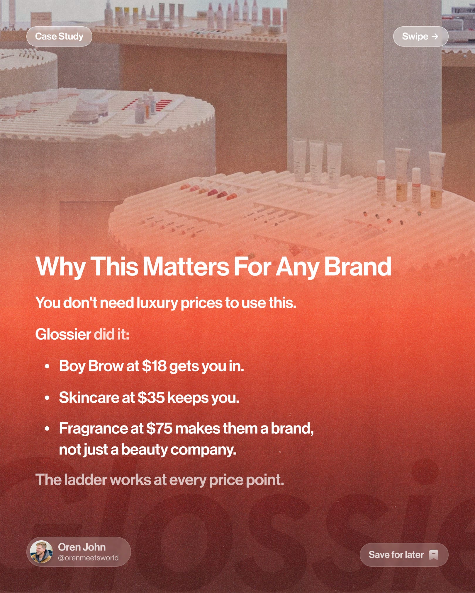
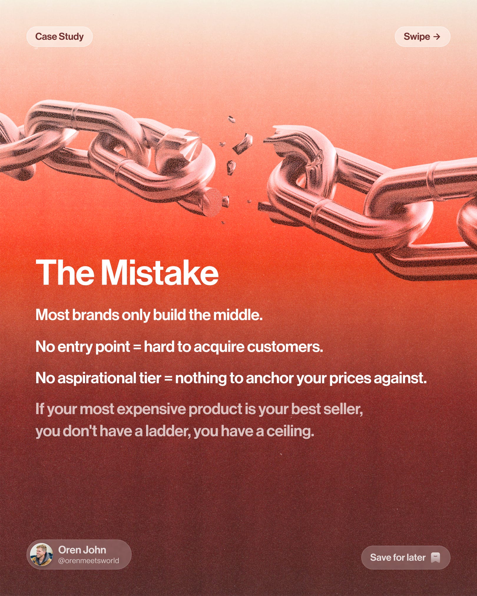
How to use pricing as a marketing tool
Thoughts on pricing products to maximize customer lifetime value and give a brand its best trajectory.
Thanks for following along.
Oren & Clayton <3 you
Hyper Reports
Check out our market reports. We spend many hours researching markets, categories, and brands & products within the consumer space so you don’t have to.